2026 is officially here, and color is taking a thoughtful, cozy, and confidently bold turn. This year’s palette is all about balance—grounded neutrals, nature-inspired hues, and a few unexpected pops that keep things interesting. If you’re thinking about refreshing your kitchen, bath, or any space in between, you’re in the right place. Our design team has been watching the trends closely, and we’re excited to share what’s ahead.
Friendly reminder: just because something is trending doesn’t mean it belongs in your home. The best designs are the ones that reflect you—your lifestyle, your routines, and what makes you feel at ease. After all, you’re the one who gets to enjoy it every day.
Trend #1: Nature-Inspired Earth Tones
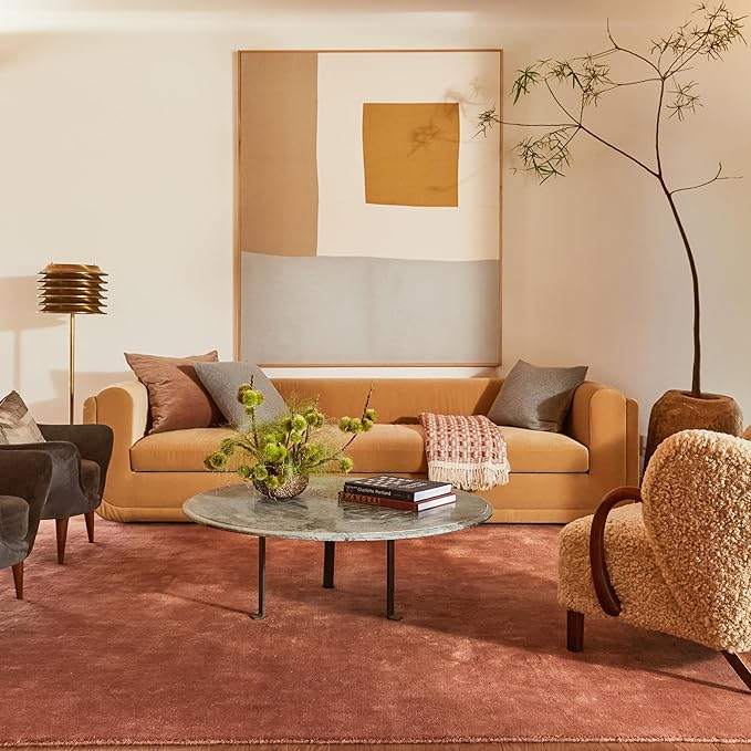
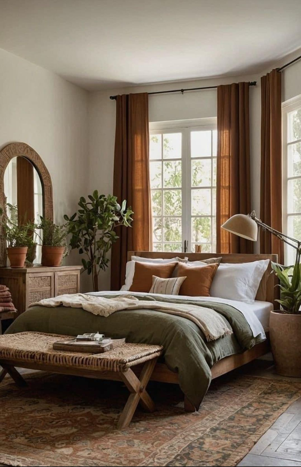
If there’s one word to describe 2026 color trends, it’s grounded. Nature continues to influence design, but this year it’s showing up in richer, warmer ways. Think olive green, sage, terracotta, sandy hues, mahogany, and warm beige—colors that feel organic, familiar, and comforting.
These tones work beautifully in kitchens and baths because they instantly create a sense of calm and livability. An olive or sage cabinet paired with warm wood accents, or terracotta tile in a powder room, can make a space feel curated without feeling overdesigned. These colors also pair effortlessly with natural materials like oak, stone, wool, and linen, reinforcing that connection to the outdoors we’re all craving.
Trend #2: Warm Neutrals (That Aren’t Boring)
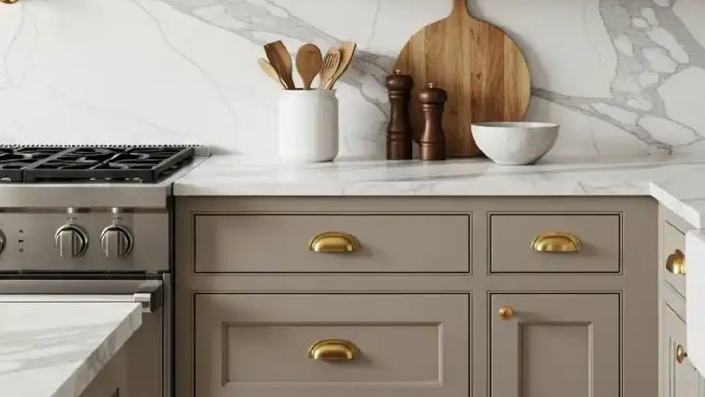
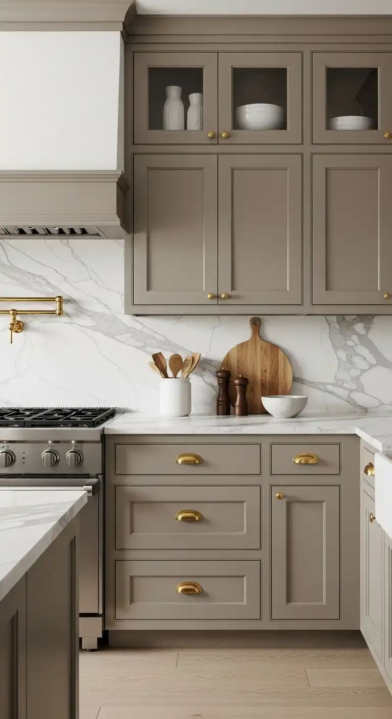
White and cool gray have had a long run, and while they aren’t disappearing completely, 2026 is all about warming things up. Enter mushroom taupes, greige, cream, and Universal Khaki—neutrals with depth, softness, and personality.
These shades are perfect if you love a timeless look but want something a little more inviting. They add warmth without overpowering a space and make an excellent backdrop for both modern and traditional designs. Whether it’s creamy walls, greige cabinetry, or a khaki-toned island, these neutrals feel elevated, cozy, and anything but flat.
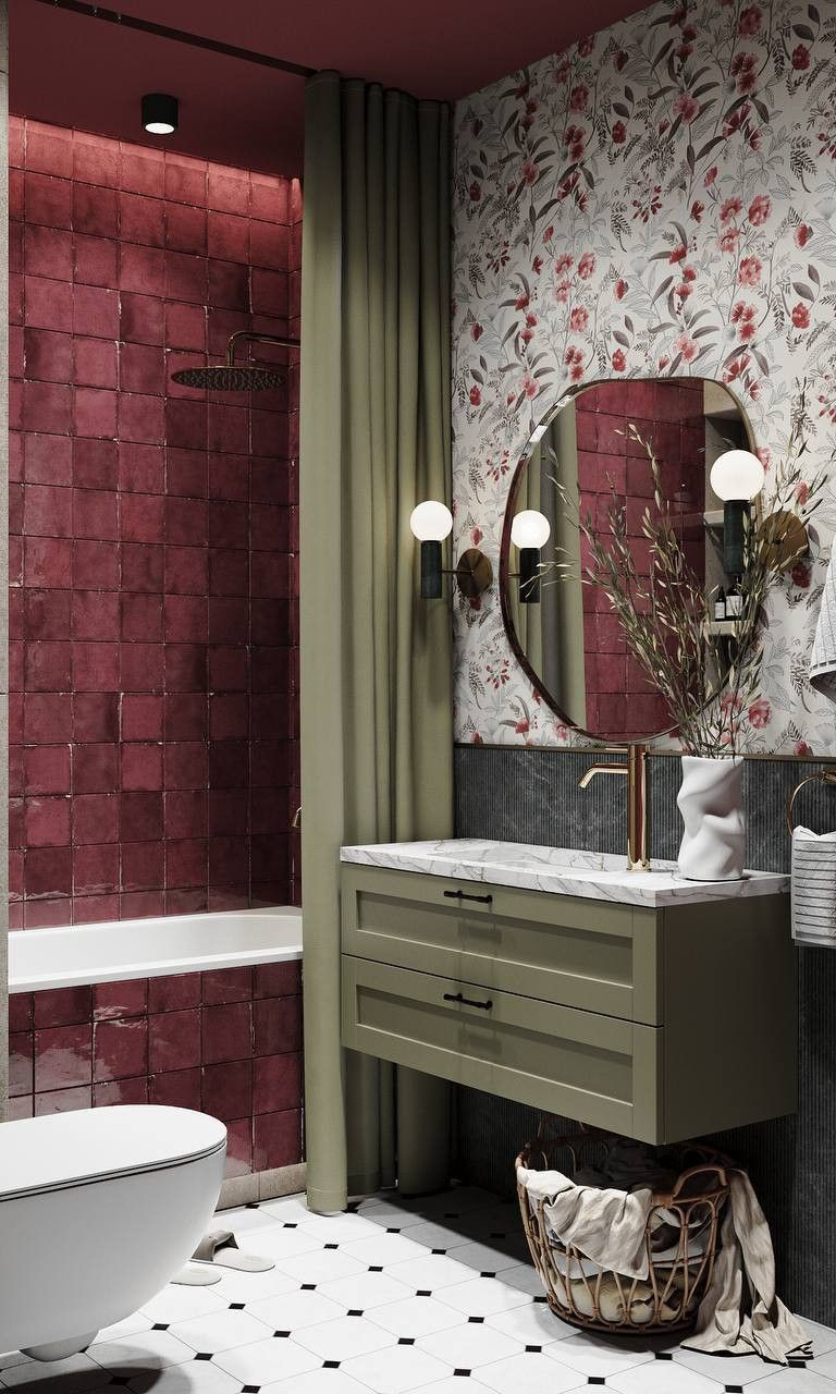
Trend #3: Deep & Moody Anchors
For those who love a little drama, 2026 delivers. Deep, moody hues like maroon, plum noir, rich burgundy, and dark teal are showing up as statement-makers and anchor colors throughout the home.
We’re seeing these shades used intentionally—on kitchen islands, bathroom vanities, built-ins, or even a bold accent wall. They bring sophistication and confidence to a space, especially when balanced with lighter neutrals or warm metallics. Not ready to commit fully? Start small. A deep teal vanity or a burgundy feature cabinet can make a big impact without overwhelming the room.
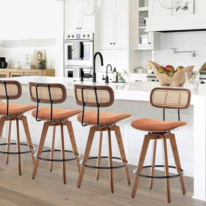
Trend #4: Vibrant Pops of Personality
While the overall palette for 2026 leans warm and grounded, there’s still room for fun. According to Pinterest and Real Simple, vibrant accent colors like emerald green, peach, and persimmon are popping up in unexpected places.
These colors shine best as accents—think bar stools, decorative tile, lighting, artwork, or even a colorful range hood. They add freshness and energy, giving your space a little wink of personality without stealing the spotlight from the main design.
Trend #5: Sophisticated Pinks Are Growing Up
Pink is sticking around—but it’s maturing. Sugary blush tones are giving way to dusty, moody pinks that feel refined and timeless. These softer pinks bring warmth and elegance, especially in bathrooms, bedrooms, or accent spaces.
Paired with brass fixtures, warm neutrals, or deep moody hues, these pinks feel elevated rather than playful. It’s a subtle way to add color while keeping things polished and classic.
Ready to bring one (or a few) of these 2026 color trends into your home? Our design center team is here to help you navigate the options and create a space that feels both current and completely your own. Schedule an appointment—we’d love to make your vision a reality.